

Have you ever walked into a business and instantly felt confident in what they offered, even before speaking to anyone?
Now flip that. Have you ever stepped into a space that made you hesitate, even if you couldn't quite put your finger on why?
In both cases, the environment was shaping your perception, and more often than not, paint color played a bigger role than you realized. Paint is one of the most underutilized tools for creating a strong, cohesive brand experience.
When done properly, the right paint colors enhance customer trust, support your brand personality, and create a sense of intentionality that sets your business apart. When done wrong, those same walls can confuse or even push people away.
In this article, you'll learn how commercial paint choices either support or sabotage your brand and the common mistakes that make all the difference.
We'll cover:
- Why Commercial Paint Colors Matter
- 5 Common Commercial Painting Mistakes
- How to Use Paint to Create a Cohesive Experience
- Real Examples of Commercial Paint Creating a Cohesive Brand Experience
Why Commercial Paint Colors Matter for Your Brand Experience
When most people think about paint color, they think about style. But for a business, paint becomes a strategic choice. What do you want your space to say?
The colors on your wall influence how customers perceive your brand, how employees feel in the space, and even how long people want to stay.
Just like your logo, font, and signage, paint is part of your visual identity. It sets the tone for your environment and tells people what to expect, often before they speak to a single employee.
For example:
- Warm neutrals can create a sense of trust and stability.
- Bold accent colors can communicate innovation and energy.
- Soft blues and greens may suggest calm professionalism.
The key is alignment; your paint colors reflect what your brand stands for, who you serve, and how you want people to feel in your space.
Color isn't just what people see. It's how it makes them feel. And that makes it one of the most powerful and overlooked tools in shaping your brand experience.
5 Common Mistakes Businesses Make with Commercial Paint Colors
Getting paint colors right in a commercial space isn't just about picking what looks good on a swatch. It's about aligning every detail with your brand experience. And yet, many businesses make costly (and completely avoidable) mistakes.
Here are the five most common:
1. Choosing Colors Based on Personal Preference
Too often, final color decisions come down to what an executive, manager, or owner personally likes. While that input matters, your paint isn't there to reflect one person's tastes; it's there to reflect your brand.
Personal preferences should take a back seat to brand alignment and customer perception.
Instead, start by asking:
- What does our brand stand for?
- Who are we trying to attract?
- What emotions do we want people to feel when they walk in?
2. Ignoring Lighting and Material Interactions
Paint can look very different under fluorescent lights versus natural sunlight or when placed next to metal, wood, or glass finishes. What looked clean and modern on the sample card might appear cold and clinical in your actual space.
Always test paint colors on your actual walls under real lighting conditions before making a final decision.
This is especially important in spaces like lobbies, conference rooms, and retail areas where first impressions matter most.
3. Not Considering the Psychology of Color
Different colors evoke different feelings. For example:
- Blues suggest calm and professionalism
- Reds evoke energy and urgency
- Greens signal balance and nature
- Neutrals tend to feel safe and versatile
If your paint colors send the wrong emotional signal, they could quietly work against your brand goals. Understanding the psychology of color helps create a positive, immersive experience.
4. Failing to Match Brand Guidelines
Your visual brand likely includes specific colors, fonts, and imagery. But paint is often chosen in isolation, without referencing brand guidelines. The result? A space that almost feels like your brand, but falls short of cohesion.
Paint colors should echo your branding, not compete with or contradict it.
This doesn't mean every wall has to match your logo (that can give you the opposite effect). However, there should be clear visual harmony between your digital identity and your physical space.
5. Trying to Be Trendy Instead of Timeless
Design trends come and go, but repainting every few years is costly and disruptive. Choosing the year's hottest color may feel current now, but it can quickly make your space feel dated or out of sync with your brand.
Aim for timeless over trendy. Choose colors that feel modern but are rooted in your brand's long-term identity. Accent walls, signage, and furnishings are great places to incorporate trend-forward colors if desired, but your core paint should have staying power.
Avoiding these mistakes ensures your paint choices support your brand, elevate your space, and create a lasting impression for everyone who walks through your door.
How to Use Paint to Create a Cohesive Brand Experience
A well-designed space doesn't happen by accident. When you approach paint selection strategically, it becomes one of the most effective and cost-efficient ways to reinforce your brand identity.
This is how to make paint work with your brand, not against it.
1. Start with Your Brand Strategy, Not a Paint Fan Deck
Before looking at swatches, revisit your brand values, target audience, and customer experience goals. Ask:
- What should people feel when they enter our space?
- What words describe our brand personality?
- Are we modern and bold? Or calm and classic?
Paint color can be seen as a communication tool. Decide what you want your message to be before picking out colors.
2. Review and Reference Brand Guidelines
If your company has a brand guide, it likely includes primary and secondary colors, logo treatments, and tone considerations. These aren't just for digital assets. They should guide your physical environment, too.
- Use brand colors as accents or inspiration
- Stay consistent with tones (warm vs. cool, muted vs. vibrant)
- Avoid introducing conflicting palettes
Brand consistency builds trust. Your space should visually echo your identity.
3. Consider the Customer Journey Through Your Space
Different areas of your building serve different purposes, and each can reinforce different aspects of your brand.
Examples:
- Lobby/reception: First impressions, energy, and professionalism
- Hallways and common areas: Transitions and tone setting
- Meeting rooms: Focus and clarity
- Restrooms and employee areas: Comfort and care
Think of your color scheme as a story. What should it say from the first step to the last?
4. Test Paint in Real Conditions
Colors can shift dramatically under different lighting and next to different materials. Before finalizing, always:
- Apply test swatches on actual walls
- View them in both daylight and artificial light
- Observe at multiple times of day
What looks great on a swatch at the store can feel drastically different in your space. Consider leaving swatches up for a couple of days to observe them under different conditions.
5. Align with Furniture, Fixtures, and Flooring
Paint is one part of the visual puzzle. Make sure your color choices complement:
- Flooring (wood, tile, carpet)
- Fixtures (metal, chrome, glass)
- Furniture (soft seating, desks, tables)
Your paint should help tie everything together, not distract from the space.
6. Partner with Pros Who Understand Branding and Application
A skilled commercial painting team ensures the choices you make are practical, brand-aligned, and long-lasting.
The right partner helps translate your vision into a finished space that feels intentional and on-brand.
Real Examples of Commercial Paint Creating a Cohesive Brand Experience
Sometimes, the best way to understand the impact of paint is to see it in action. Here are a couple of recent commercial painting projects where thoughtful color choices played a direct role in strengthening the brand experience.
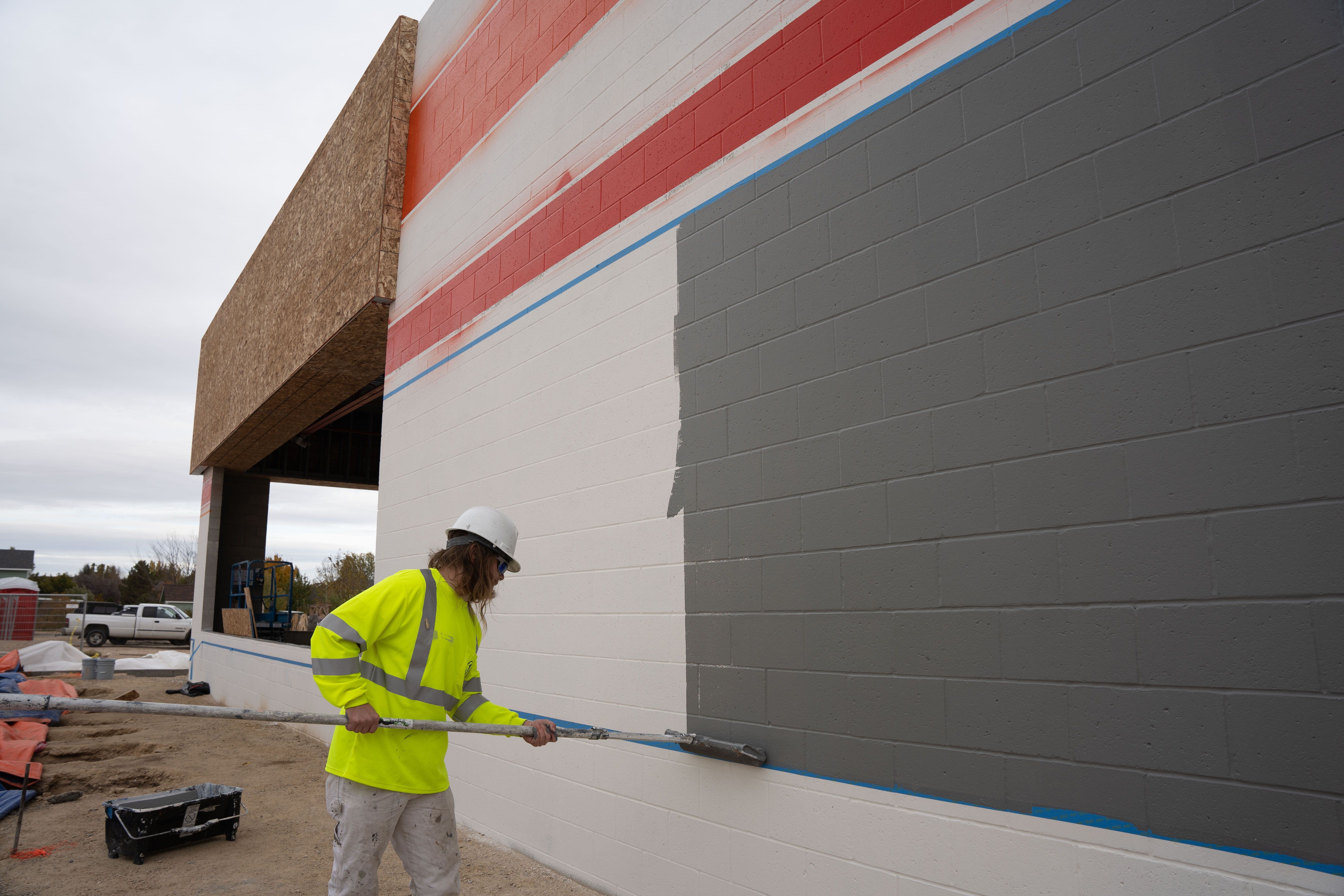
Autozone - Meridian, Idaho
Project Type: Exterior and interior commercial repaint
Challenge: Maintain a national brand consistency
Color Approach: Signature AutoZone red and orange with black and gray accents; neutral interior walls with branded highlight zones.
The goal here wasn't to reinvent. It was to reinforce. AutoZone has a recognizable color scheme, and customers expect a certain look and feel. Our role was to deliver a high-quality finish that matched brand standards exactly and held up under high-traffic conditions.
The result was a space that was quintessentially Autozone, giving both customers and employees confidence in the space.
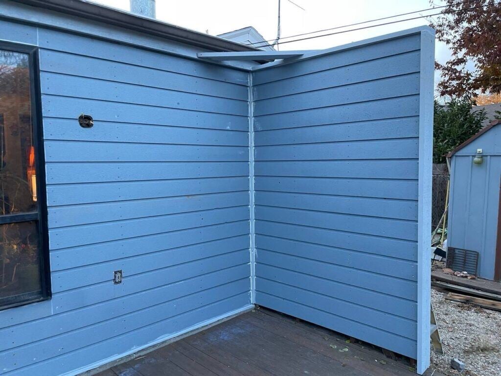
Swipe through to see the progress on this project:


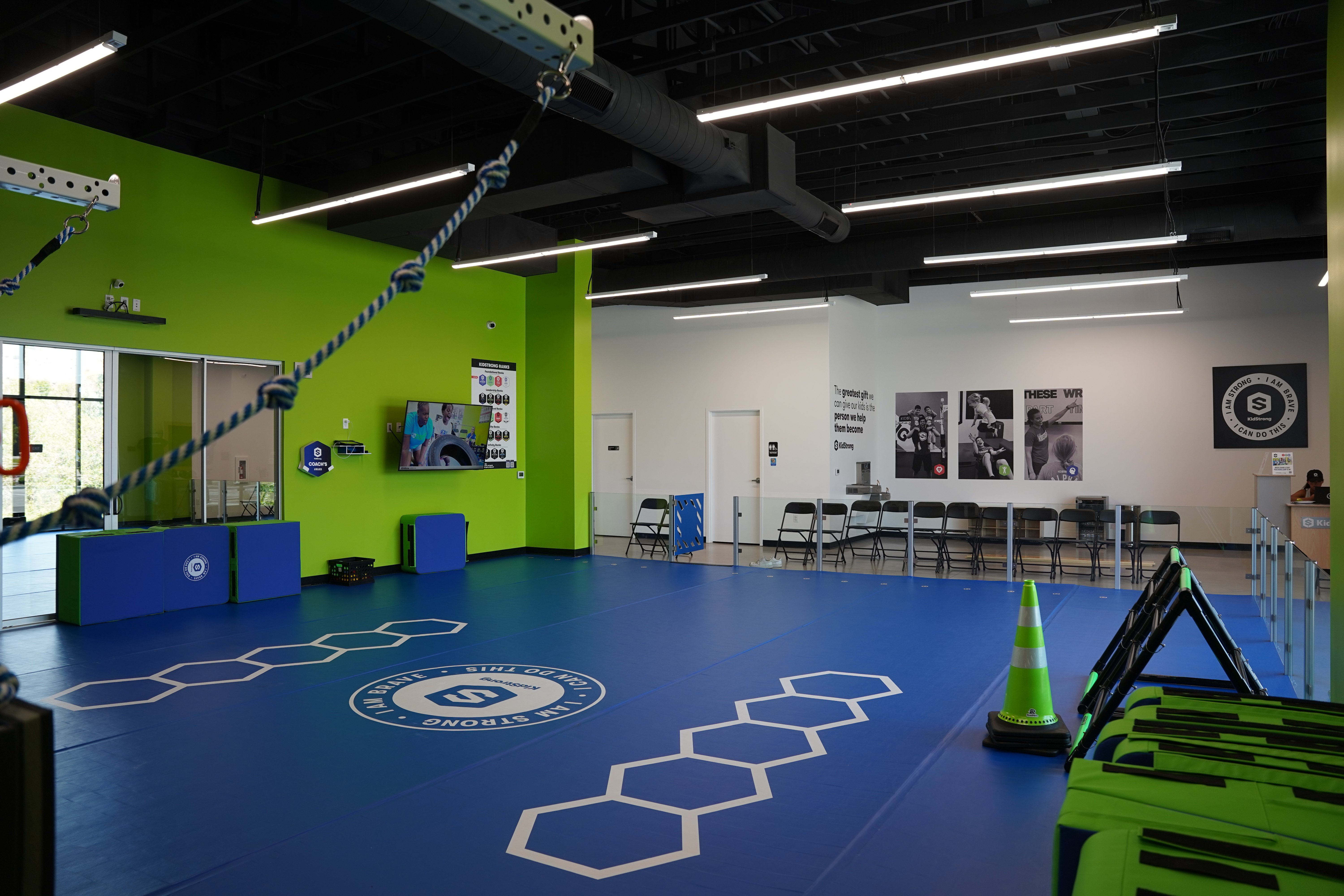
KidStrong - Boise, Idaho
Project Type: Interior commercial paint for a national kids' fitness brand
Challenge: Create a space that felt fun, active, and high-energy without overwhelming your kids or parents
Color Approach: A bold palette of vibrant green, black, and white with zones that felt open but focused
The bright green definitely gives a vibe. It screams positive energy and excitement. These interiors reinforce KidStrong's energetic, empowering brand identity.
The final look is bright, cohesive, and fun, creating an immersive experience the moment families walk in the door.
Swipe through to see the project progress:


Don't Have a National Brand? This Still Applies to You.
Even if you're a local or regional business without national brand guidelines, paint still plays a key role in how customers and employees experience your space. Color can communicate professionalism, creativity, and trust, or, when it's not planned well, chaos.
Better Commercial Painting for Your Brand Experience
At the end of the day, your commercial space is an extension of your brand, and it deserves careful consideration. Your paint colors can elevate your customer experience or work against you.
Now that you know what mistakes to avoid and how to choose paint with intention, you're already ahead of the game.
So, whether you're refreshing a single location or rolling out a multi-site brand update, the smartest move you can make is to choose paint with the same strategic thinking you'd apply to your website, logo, or customer service.
At Roe Painting, we've helped hundreds of businesses across Idaho and Nevada bring their brands to life through smart, strategic commercial painting, and we'd love to help you do the same. Schedule a complimentary consultation to get started.
Topics:


