


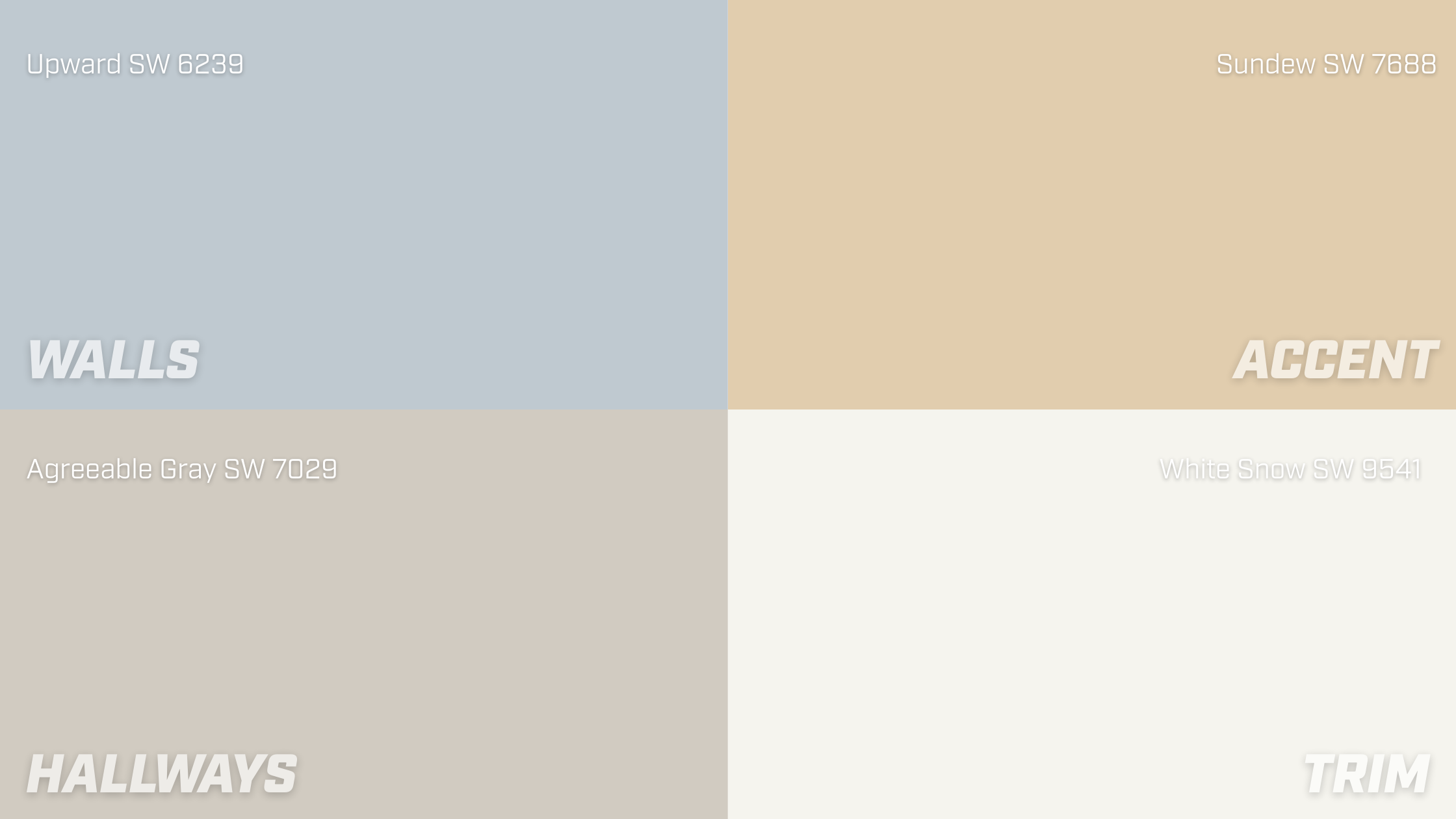
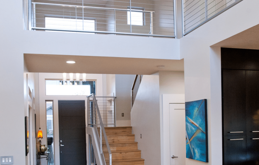
Picking a paint color should be the fun part. But for many home and business owners, it quickly becomes the most frustrating step of the project.
What looked perfect on the swatch feels too bold on the wall, or that “safe” neutral suddenly looks pink in afternoon light. Before long, you’re second-guessing every option and wondering if you’ll ever feel confident pulling the trigger.
At Roe Painting, we’ve helped thousands of customers navigate this decision, and we’ve seen how color, when applied correctly, brings clarity and direction to what often feels like a guessing game. It’s not about knowing the color wheel by heart; it's about understanding how color interacts with your space, your lighting, and your personal style.
In this article, we’ll walk you through the practical side of color theory—what it is, how it works, and how you can use it to finally land on a color you love (and won’t regret a month later).
We'll cover:
- Why Picking Paint Feels So Overwhelming
- What Color Theory Actually Is and Why It Helps
- How to Use Color Theory in Your Space
- Five Common Color Mistakes and How to Avoid Them
Why Picking Paint Feels So Overwhelming
There’s a reason choosing a paint color feels harder than it should. It’s not just about picking what looks good. It’s about predicting how a color will behave in your space.
Even if a color looks perfect on a sample card or in someone else’s home, that doesn’t guarantee it’ll work in yours. Here’s why:
Lighting changes everything.
Natural light, artificial light, and even the time of day all impact how a color reads on the wall. What looks warm and soft in the morning can feel stark or cool by evening.
Undertones are easy to miss–until it’s too late.
That “neutral” beige might have a pink or green undertone that only shows up once the paint’s dry and the furniture is back in place.
There are too many options.
Standing in front of hundreds of swatches is overwhelming. Without a clear starting point, it’s easy to fall into second-guessing and decision fatigue.
You want to be right the first time.
Paint isn’t permanent, but it’s not something you want to redo a month from now. That pressure can make every decision feel heavier than it needs to be.
The good news is this: once you understand the basics of how color works and how it interacts with light, surroundings, and emotion, you can make more confident choices without overthinking every shade. That’s where color theory comes in.
What Color Theory Actually Is—And Why It Helps
Color theory is a simple way to make sense of why certain colors work well together and why others don’t.
It gives you a framework for choosing colors that not only look good, but feel right in your space.
At its core, color theory is based on how colors relate to each other on the color wheel. You don’t need to be an artist or designer to use it. You just need to know a few key ideas:
Warm vs. Cool Colors
Warm colors (reds, oranges, yellows) tend to feel cozy, energetic, or bold. Cool colors (blues, greens, purples) often feel calm, clean, or expansive. The “temperature” of a color can change how a space feels, even if the color is subtle.


Photo Credit: ChatGPT
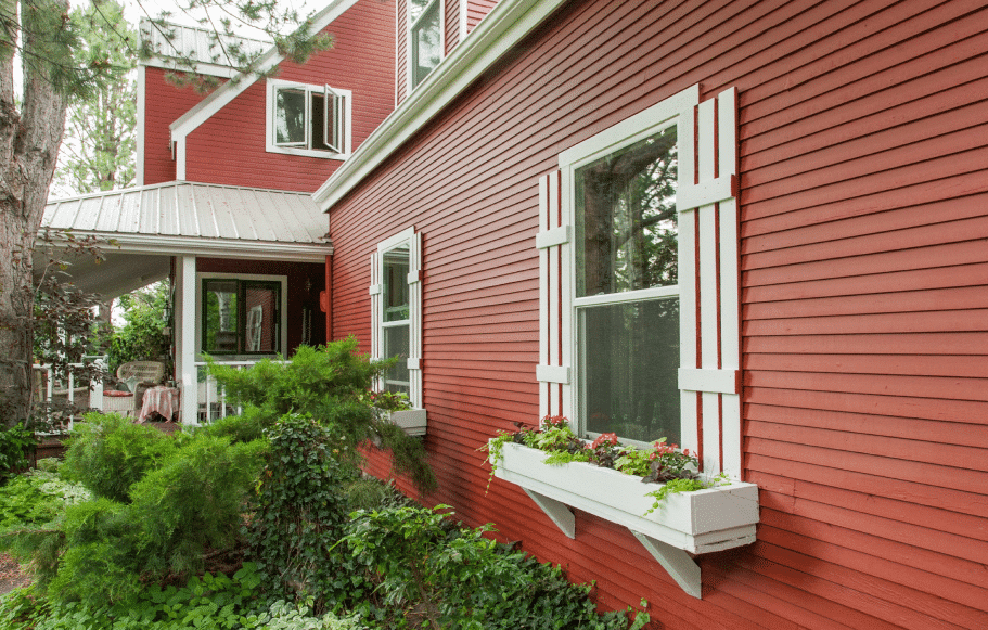
Complementary Colors
These are colors that sit opposite each other on the color wheel (like blue and orange or green and red). Used together, they create contrast and make each other stand out. They’re great for accent walls or trim.

Photo Credit: ChatGPT
Analogous Colors
These are colors that sit next to each other on the color wheel (like blue, blue-green, and green). They feel more harmonious and are a solid choice when you want a space to feel relaxed or unified.

Photo Credit: ChatGPT
Color = Mood
Colors affect how we feel in a room. Blues tend to feel calming. Yellows can feel cheerful or energetic. Deep greens can bring in a sense of grounding. The color you choose sets the tone—sometimes literally.
The key to getting it right is knowing that color theory gives you a starting point when you’re staring down a wall of options. It helps turn a feeling, like “I want this room to feel brighter,” into a direction you can actually act on.

How to Use Color Theory in Your Spaces
Color theory isn’t just about what looks good on a wheel; it’s about making sure the color you choose works with everything that already exists in the space.
Here’s how to take theory and turn it into a practical paint choice:
1. Start with the Mood You Want
Before you choose a color, decide how you want the room to feel. Do you want it to feel calm and restful? Energized? Cozy? Spacious?
Once you know the emotional goal, you can choose temperatures (warm or cool) that support that. This can be especially important when choosing paint colors for your business.
For example: Cool blues and greens often create calm. Warm, earthy tones can evoke a sense of grounding or welcome.
2. Let the Room’s Permanent Features Guide You
Your walls aren’t the only color in the room. Flooring, countertops, cabinetry, tile, and large furniture all carry undertones that will influence how paint colors look.
- Is your floor warm wood or cool stone?
- Are your kitchen cabinets bright white or slightly creamy?
- What colors dominate your furnishings or artwork?
These fixed elements should help narrow your paint options, not fight against them.
3. Factor in Your Lighting
Lighting changes everything. A color might look completely different in morning sun than under evening lamps. Here’s what to consider:
- Natural light brings out undertones clearly (test at different times of day).
- Warm bulbs (incandescent or soft LED) can add yellow/orange tones.
- Cool bulbs (fluorescent or daylight LEDs) can make colors feel cooler or even stark.
Tip: Always test your paint in the actual room and check it at different times of day.
4. Use Color Relationships to Build a Palette
This is where the color wheel can help:
- Want contrast? Use complementary colors—like navy with gold or terracotta with gold.
- Want harmony? Use analogous colors—like sage green with soft blue.
- Want subtle depth? Use shades from the same color family with different saturation levels (dusty rose with a deep mauve).
5. Stick With What You’re Drawn To
Sometimes the best clue is right in front of you.
Look at your wardrobe, your favorite rooms, or the things you’ve already chosen for your home or space. Color preferences tend to repeat, and they’re often a good reflection of what you’ll love living with every day.


Five Common Color Mistakes (And How to Avoid Them)
Even with good instincts and plenty of samples, choosing the wrong paint color still happens, but most mistakes are avoidable once you know what to watch for.
These are the top five mistakes we see, along with how to stay ahead of them:
Mistake #1: Choosing Color in the Store
Paint chips under bright retail lighting rarely translate well at home. That perfect “greige” under fluorescent lights might look beige-pink once it’s on your wall.
✅ Fix: Always take swatches home. Better yet, order large peel-and-stick samples and test them in your actual space under your real lighting.
Mistake #2: Ignoring Undertones
“Neutrals” are rarely completely neutral. They all come with some type of color undertone–be it blue, green, or purple. Those undertones can really shine once paired with your furniture, flooring, or trim.
✅ Fix: Compare your top color picks side by side against the materials already in your space—especially whites, wood tones, and tile.
Mistake #3: Overcommitting to a Trend
Popular colors come and go. What’s on trend right now might feel tired in two years, especially if it doesn’t fit your space or style.
✅ Fix: Use trendy colors for accents–like a single wall, bathroom, or front door—and stick with timeless choices for main living areas.
Mistake #4: Being Afraid of Depth
Many people go too light, assuming it’s safer. But pale colors can feel washed out or dull, especially in large rooms with lots of natural light.
✅ Fix: Don’t rule out medium or darker tones—when chosen well, they can add warmth, drama, and dimension without overwhelming the room.
Mistake #5: Trying to Match Everything
When walls, floors, trim, and furniture are all the same tone, a room can fall flat or feel monotone.
✅ Fix: Use contrast intentionally, either through complementary colors or by varying lightness and saturation within a single color family.
Helpful Tools to Make Color Theory Easier
You don’t have to rely on guesswork. There are tools that bring color theory to life and make testing paint choices simple.
If you’re still narrowing things down, these two resources can help:
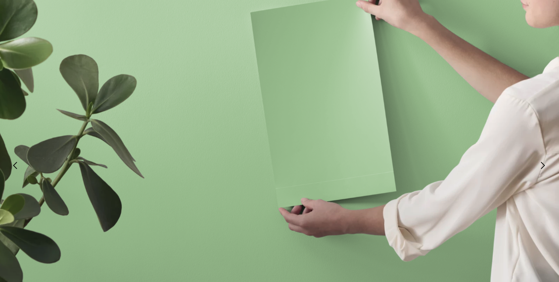
Try a Visualizer or Order Peel-and-Stick Samples
Learn how to use virtual paint tools and large-format samples to test your ideas in real-time in your home or space.
👉 Read: How to Choose a New Paint Color
Need to Match an Existing Color Instead?
If you’re working around an existing wall color and need a seamless match, here’s how to do it confidently–no painter required.
👉 Read: How to Match Your Existing Paint Color
From Overwhelmed to Confident
You’ve probably stood in front of a wall of paint swatches wondering why something so simple feels so hard. Maybe you’ve even painted a room, only to realize the color wasn’t quite right once the lighting changed or the furniture came back in.
Now, you understand why color can be so tricky, and more importantly, how color theory gives you a clearer path forward. You know what to look for, how to test it, and how to make sure your color choice actually works with your space, your light, and your style.
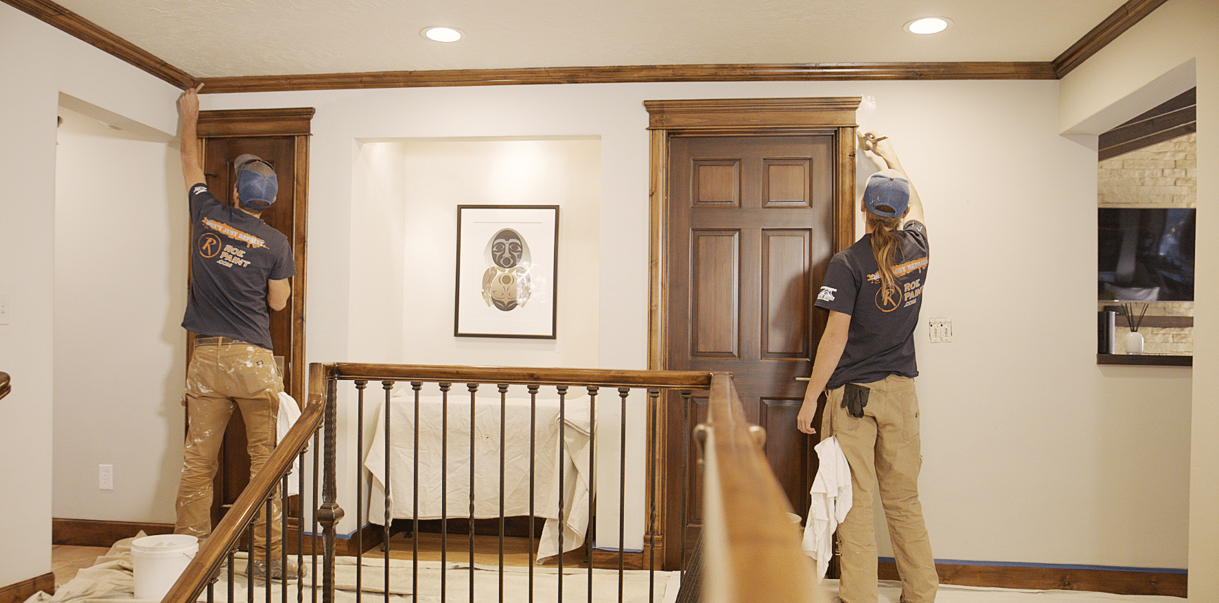
And when you’ve found the color that feels like the right fit, Roe Painting is here to bring it to life with professional application and a beautiful finish. No streaks or surprises, just results that match your vision.


