Mastering Complementary Color Schemes for a Cohesive Home Design
August 29th, 2025
6 min read
By Jud Masters
Choosing paint colors for your home can feel overwhelming. Between endless swatches, second-guessing, and worrying about whether colors will clash once they're on the walls, many homeowners end up playing it safe with neutrals or postponing decisions altogether.
At Roe Painting, we know the challenge isn't always about finding a color you like. It's knowing how to make multiple colors work together in a way that feels intentional and cohesive. That's where complementary color schemes come in. By understanding a few key principles, you can create spaces that flow beautifully from room to room while still letting each area shine on its own.
In this article, we'll walk you through the basics of complementary colors, share real-life pairings inspired by Sherwin-Williams' Colormix 2026 palettes, and show you how to apply them throughout your home. Whether you're refreshing a single room or rethinking your whole-house palette, you'll leave with practical ideas and the confidence to choose colors you'll love living with.
Why Complementary Color Schemes Work in Home Design
When we are talking about design, complementary colors are technically opposites on the color wheel – like blue and orange, red and green, or yellow and purple. When paired together, they create a striking contrast that feels balanced and natural to the eye. That's why a soft blue wall can look so fresh with copper accents, or why sage green feels so beautiful when paired with plum or lavender.
But when most of us are talking about "complementary colors," what we really mean is colors that look good together. Sometimes that does mean bold opposites, but it can also include:
- Analogous palettes (colors that sit side-by-side on the wheel, like blue and green) for a calm, blended feel
- Monochromatic palettes (different tints and shades of the same color) for a refined, tone-on-tone look
- Neutral + accent palettes (soft whites or grays with a single bold pop) for modern versatility
So while complementary schemes in the strict sense deliver drama and contrast, the bigger goal is harmony. The right palette makes each room feel intentional on its own and connected to the spaces around it.
For a deeper dive into the science of the color wheel and how hues interact, check out our full article on Paint Color Theory.
That's why "complementary" is such a powerful starting point: it's less about a rigid rule, and more about a framework for creating rooms that feel both cohesive and stylish.
How to Build a Cohesive Paint Color Palette Throughout Your Home
The biggest mistake that homeowners make when it comes to paint colors isn't that they picked the wrong shade; it's that they choose a color in isolation. A room might look great on its own, but when you walk through the house, the palette feels disjointed. The goal is to build a set of colors that not only work individually but also transition smoothly from space to space.
Step One: Choose a Base Color You Love
Start with a foundation color that sets the tone for your home. This could be a versatile neutral like Sherwin-Williams White Snow or Agreeable Gray, or a soft color with personality like Upward. This base becomes the anchor you'll build around.
For more guidance on narrowing down a single shade, see our article on How to Choose Paint Colors.
Step Two: Add Complementary and Supporting Colors
From your base, layer in complementary or harmonious shades:
- Use bold opposites for accents (navy walls with coral accessories)
- Use analogous shades for flow (soft greens next to rich emeralds)
- Don't forget how you can use trim, doors, and ceiling colors to bring everything together.
Step Three: Consider the Flow of Connected Spaces
If you have an open floor plan, prioritize smooth transitions. A neutral base with subtle color shifts (like pale gray flowing into muted blue) helps avoid visual clashes when you can see multiple rooms at once.
Step Four: Balance Bold Color Choices with Neutrals
A whole house painted in bold complements can feel overwhelming. Anchor brighter shades with complex neutrals. The key is intention. By planning your palette as a whole, you'll create a home that feels cohesive, not chaotic, no matter how colorful you want to be.
Best Whole-Home Color Palettes for Today's Homes
A great color scheme is a collection of colors that flow together from room to room. Here are some curated palettes, each with a mix of neutrals, anchors, and accents you can adapt to your style.
Bold & Energizing Paint Palette
- Naval SW 6244 (anchor)
- Coral Island SW 6332 (accent)
- White Snow SW 9541 (trim/doors)
- Passive SW 7064 (soft gray for balance)
- Dusty blush or copper tones (decor + textiles)
Why it works: Contrast-driven but balanced with light neutrals. Ideal for dining rooms, offices, or living areas where you want personality.

Serene & Restorative Paint Palette
- Modern Lavender SW 9688 (accent wall or textiles)
- Liveable Green SW 6176 (walls)
- Alabaster SW 7008 (trim/ceilings)
- Evergreen Fog SW 9130 (deeper anchor)
- Natural woods + soft beige (furniture and flooring tie-ins)
Why it works: Creates a soothing, spa-like feel. Perfect for bedrooms or bathrooms.

Timeless Neutral Color Palette with a Twist
- Sanderling SW 7513 (warm beige base)
- Inkwell SW 6992 (doors or cabinetry)
- White Snow SW 9541 (trim/ceilings)
- Evergreen Fog SW 9130 (supporting accent)
- Metallics or natural stone textures (decor)
Why it works: Neutrals carry the main spaces, while bold contrasts give definition. Great for open floor plans.

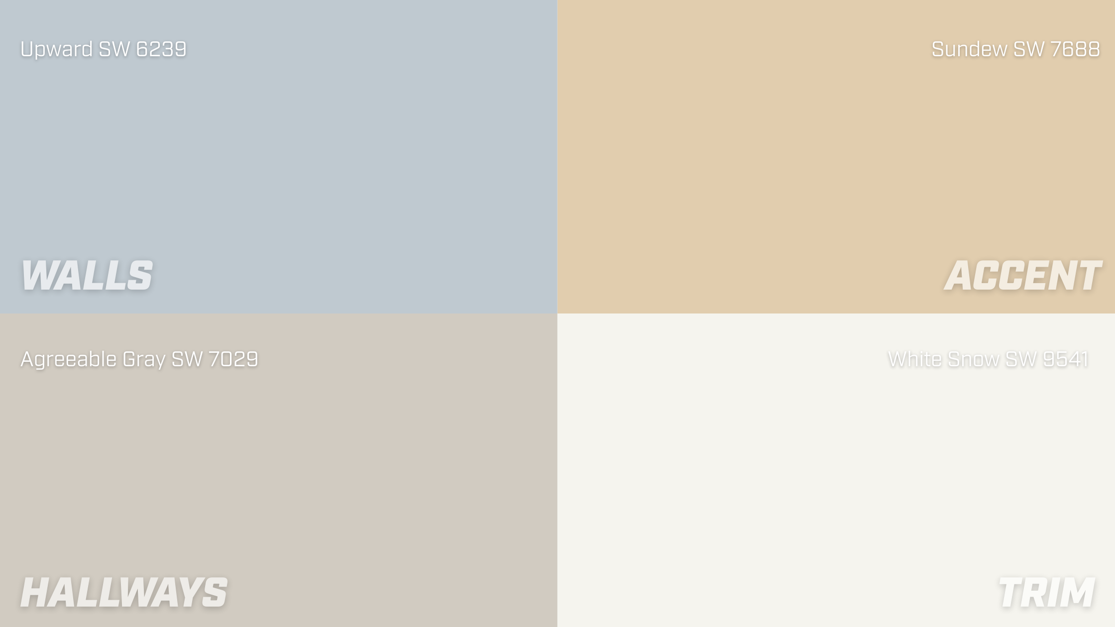
Fresh & Airy Color Palette
- Upward SW 6239 (walls)
- Sundew SW 7688 (accents in kitchen or playrooms)
- Agreeable Gray SW 7029 (connecting hallways)
- White Snow SW 9541 (trim)
- Pale aqua or sage accents (accessories and art)
Why it works: Cheerful without being overwhelming, it lets light flood the space.

The best palettes have layers, not just one statement wall. By choosing a mix of anchor colors, neutrals, and accents, you give yourself flexibility to create variety while keeping the house cohesive.
For all our best resources on choosing paint colors, check out the Paint Color Selection Guide.
Room-by-Room Guide to Using Paint Color Palettes
Every room in your home has a different purpose, and your color palette should support it. By assigning colors intentionally, you can create spaces that feel unique while still tying into your whole-home scheme.
Living Room: Welcoming and Balanced
- Walls: Use your base neutral (like Agreeable Gray) for flexibility.
- Accent: Add pops of your anchor color on pillows, rugs, or one feature wall.
- Trim/Doors: Crisp white like White Snow keeps the look clean.
- Why: This balance creates a welcoming atmosphere without overwhelming a high-traffic space.
Kitchen: Functional with Personality
- Cabinets: Stick to timeless shades or wood tones.
- Walls/Backsplash: Pull in lighter supporting tones like Upward.
- Accents: Add complementary energy with barstools, décor, or pendant lights in your bold color.
- Why: Kitchens benefit from neutral foundations with colorful accents that are easy to update.
Bedroom: Restful and Restorative
- Walls: Choose calming shades like Liveable Green or Modern Lavender.
- Trim/Ceiling: Soft whites like Alabaster keep the space light.
- Accents: Layer bedding, curtains, and art in muted versions of your complementary color.
- Why: Bedrooms work well with softer, muted tones that encourage relaxation.
Bathroom: A Place to Refresh
- Walls: Play with soothing shades like Halycon Green (SW 6213).
- Vanity: Contrast with a complementary accent like coral or navy.
- Accents: Towles and décor in your supporting colors pull it all together.
- Why: Bathrooms are small enough to handle bold accents without feeling overwhelming.
Hallways and Connecting Spaces: The Glue
- Walls: Stick to your base neutral for flow.
- Doors/Trim: Add consistency with the same white, black, or coordinating color throughout.
- Why: Neutral connectors prevent color fatigue and let each room's personality shine
If your home were a book, each room is a chapter that both stands alone but ties the whole story together.
Tips for Making Complementary Colors Feel Natural
Even with a well-chosen palette, the way you apply color makes all the difference. Here are five pro tips to help your colors feel intentional, not overwhelming:
1. Balance Bold with Subtle: If you go big with a statement wall, balance it with neutrals elsewhere. Think navy walls paired with light gray furniture.
2. Repeat Colors in Small Touches: A pop of coral on a throw pillow, echoed in a piece of art across the room, feels cohesive instead of random.
3. Use Texture to Add Depth: Paint is the only way to show off color. Fabric, wood tones, metals, and even plants bring variety without adding more paint.
4. Pay Attention to Light: A color that feels soothing in morning light may look stark at night. Always test samples in your actual space before committing. The Color Selection Guide has great tips for testing colors.
5. Don't Overcomplicate It: Three to five colors are usually enough for an entire home palette. Beyond that, things can start to feel chaotic.
The goal is to create a home that feels like you. With a few simple strategies, even bold complementary palettes can look natural and timeless.
Creating a Home that Flows
Choosing colors doesn’t have to feel like guesswork. By building a complementary palette with neutrals, accents, and bolds that work together, you can create a home that feels stylish and cohesive from room to room.
Remember, the best palettes aren’t about following trends. They’re about finding combinations that reflect your taste and lifestyle.
Your next step is to pick one of the palettes that caught your eye, grab a few samples, and test them in your space. Notice how they look in natural light, how they flow with your furniture, and how they make you feel.
When you’re ready, Roe Painting is here to bring your vision to life with the craftsmanship and detail your home deserves.
Jud has been with Roe Painting since 2017 and in the painting industry as a whole since 1999. He has a passion for estimating and selling a wide variety of painting projects. As the son of two teachers, he loves to educate his customers on what they should expect in a proper paint job. As VP of Sales, he enjoys developing estimating programs and teaching and coaching his sales team to deliver a confident contracting experience for every customer.
Topics:


